
41 Critical Ecommerce Conversion Rate Optimization Tips
Aug 14, 2020|Read time: 18 min.
Key Points
- An ecommerce conversion rate is typically defined as the percentage of website visitors who purchased something from your ecommerce website during a set timeframe.
- It’s important to keep track of your conversion rates so that you can measure performance over time, and can then optimize accordingly for ever-increasing returns.
- From branding to SEO and the checkout process, this post outlines 41 distinct methods for effective ecommerce conversion rate optimization.
The average conversion rate for many ecommerce websites is around two percent. This means if get 10 million visits each month, then 9.8 million of them don’t convert.
That’s why ecommerce conversion rate optimization (CRO) is so important.
There’s no silver bullet to increasing your conversion rate. Rather, it takes a holistic effort across various aspects of your business and website, including areas of branding, SEO, technical infrastructure, product pages, and checkout process.
With the right approach, conversion rate optimization for ecommerce websites can amplify results like these even further:
0
MTerakeet delivered 1.5 million monthly organic visitors
–Case Study0
%Terakeet increased YOY monthly organic revenue by 30.2%
–Case StudyWhat is ecommerce conversion rate?
An ecommerce conversion rate is typically defined as the percentage of website visitors who purchased something from your ecommerce website during a set timeframe.
However, looking deeper, there are more conversion points in your site that you should be measuring beyond just sales. Many micro-conversions are indicative of a positive experience or buyer intent. It’s therefore important to ensure these conversion rates are high to deliver strong rates of purchase.
Micro-conversions prior to a purchase in an ecommerce website often include:
- Adding a product to the shopping cart.
- Adding an item to a wish list.
- Joining the mailing list.
- Telling a friend.
- Downloading a content piece (e.g., lookbook)
- Sharing via social media.
- Or, any other valuable KPI.
How to calculate ecommerce conversion rates
Regardless of which ecommerce platform you use—Shopify, BigCommerce or Magento—it’s fairly straightforward to calculate your conversion rate. You divide the number of purchases by the number of site visits, or you can divide the number of converting shoppers by the number of unique shoppers on the site.
When looking at micro-conversions, it follows a similar pattern. For example, it would be the number of new mailing list sign-ups or people adding to a wish list vs. site visitors, etc.
For something like sharing on social media, you might substitute site visitors with social followers.
It’s important to keep track of your conversion rates so that you can measure performance over time, and can then optimize accordingly for ever-increasing ecommerce returns.
To that end, here are 41 crucial ecommerce conversion optimization tips.
Value of Organic Search White Paper
See how an investment in organic search delivers ROI that compounds over time.
Ecommerce conversion rate optimization
What is ecommerce marketing worth if you can’t convert website visitors into paying customers?
But, as valuable as CRO is, it isn’t as simple as a quick website redesign. It requires deep analysis, constant tweaks and ongoing iteration. You’ll need to unify your ecommerce marketing strategy, including SEO, email marketing, remarketing and social media.
Branding
Branding is a vital part of ecommerce marketing because it conveys trust and consistency to users.
1. Have a professional website
If you want more conversions, work on strengthening your brand before you start conducting ecommerce conversion rate optimization activities on your site. A strong brand is a foundation of a strong ecommerce business, and naturally leads to more conversions, sales, and repeat purchases.
2. Make it immediately clear they’re in the right place
When they land on your site, make sure they know immediately whether they are in the right place or not. Provide them with clear visual and messaging cues so that they know whether your ecommerce store is right for them. For example, let’s say you sell running gear, is your audience serious runners (e.g., Fleet Feet) or instead those interested in fashion and style (e.g., Finish Line)?
3. Clarify your value
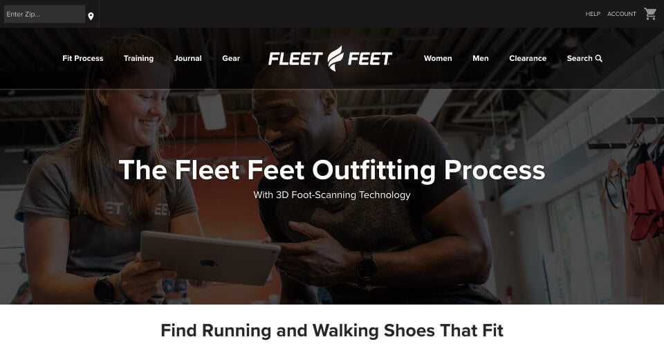
Make sure you have clear positioning and differentiation, core values, and spot-on messaging. Visually, make certain that you have a distinctive look and feel that appeals to your target audience with recognizable colors, fonts and visual elements.
Perhaps like Fleet Feet, it’s all about performance. In Fleet Feet’s case, the claim to fame is the in-store ability to fit each individual customer with 3D scanning technology to take precise measurements of your feet as part of the fitting process. Then, the biomechanics of your foot are diagnosed, while a scanner captures 12 data points — length, width, arch height, etc. — for personalized shoe and insole recommendations.
Compare that with Finish Line, where it’s all about bringing you the latest shoes, the latest technology, and the latest trends. Frequent references to “kicks” and prominent promotions of new sneaker drops fit the focus on shoes as a fashion statement.
4. Establish a distinctive voice and tonality
Just as a brand should have a specific visual look and feel, it should also have a certain voice, as well. Is your voice distinctive? Is your voice clearly aligned with the personification of your brand? Be sure that the tonality is consistent.
Compare the brand voice difference of Fleet Feet and Finish Line.
- Fleet Feet: “Fleet Feet knows running… We combine knowledge gained from our four decades of experience with data-driven insights from modern technology to outfit runners with the ideal shoes, apparel and gear.”
- Finish Line: “We exist at the intersection of ideas — Where performance meets style. Where classic meets technology. Where street meets fashion.”
5. Display positive product reviews
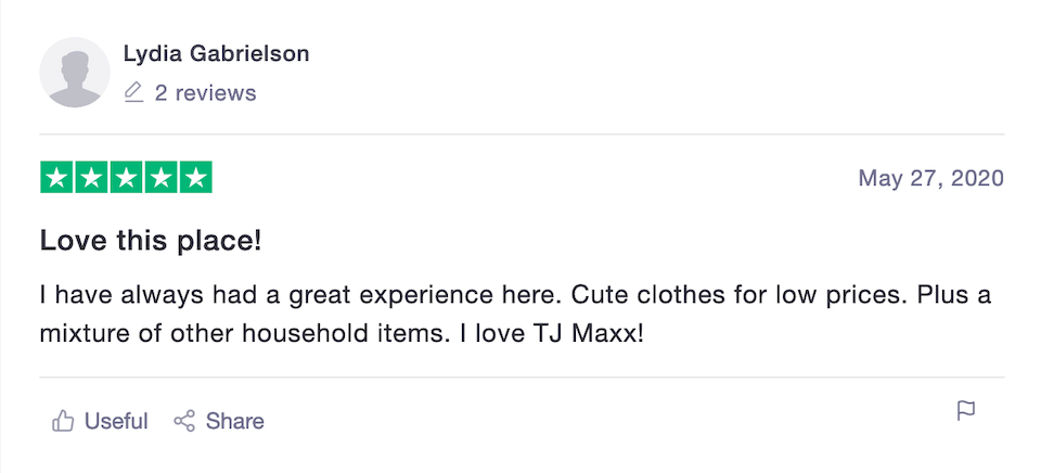
Conversion rate optimization for ecommerce sites would not be complete without product reviews. As Robert Cialdini explains in his book Influence: The Psychology of Persuasion, social proof is one of the most effective means of influencing someone’s decision making.
In the world of ecommerce, one of the most powerful forms of social proof is customer reviews. Be sure to solicit reviews from your customers after they make a purchase or if you notice them posting a positive mention on social media. You cannot tell them what to say, but if you are confident that you have happy customers, you can nudge them towards a greater volume of reviews.
6. Build trust
Positive product reviews are a form of trust-building with your audience. Beyond reviews, though, look to build trust with your site visitors in other ways, including:
- Include testimonials
- Provide case studies
- Offer free returns and clearly state shipping costs
- Offer a satisfaction guarantee
- State how many customers you have
- Mention how many real-world stores you have
- Have a robust FAQ page
- Make it clear upfront what payment methods you accept, like PayPal or Apple Pay
- Link to a privacy policy
- List a hotline for any questions
- Feature happy customers
- Display security symbols such as SiteLock, GeoTrust, or Sucuri
- Support causes that your audience cares about
Trust is a crucial factor in boosting conversions. According to Groove, testimonials can increase conversions by as much as 15%. So, provide ample forms of social proof on your product pages.
7. Improve user experience with Voice of the Customer
No matter your differentiation, voice, or points of trust, all successful ecommerce websites must deliver a superior user experience. Get shoppers’ feedback and uncover what they like and what they don’t like. Use Google analytics or specialized behavioral analysis software (see below) to uncover their digital body language and optimize the experience.
And don’t just collect data. Go all in and create a Voice of the Customer (VoC) strategy to scale feedback and implement change.
Content Strategy Playbook
The Fortune 500 CMO’s guide to content strategy.
Ecommerce SEO
8. Optimize your site for organic search (SEO)
Search engine optimization (SEO) of your ecommerce website is one of the most cost-effective ways to increase qualified website traffic throughout the funnel. With Amazon encroaching on more and more businesses, having a strong organic presence in Google is important in maintaining a healthy pipeline to your website.
The best ecommerce SEO strategy combines website structure, technical SEO, keyword research, content strategy, on-page optimization, and link building with incredible user experience to deliver unmatched results.
9. Align pages with intent
When you optimize for the search engines, be sure to do so in a way that aligns your pages with the searcher’s intent. Whereas one audience member may be searching a specific product, another may be looking for ways to care for their product, for example. If you want qualified traffic that leads to a fulfilling experience, it’s imperative that you focus on the intent of your audience at the time of their search.
10. Organize your website taxonomy
Your site architecture is like an org chart for your website: it communicates hierarchy as well as the relationships between various pages. Website architecture is a fundamental part of an effective ecommerce SEO strategy because it organizes and prioritizes your content for search engines. Build a website taxonomy that’s clear and as flat as possible in order to minimize the number of clicks needed to reach your product pages more quickly. It’s also important to properly reinforce this architecture through intelligent internal linking.
11. Strengthen your category pages
Category pages are the first step for many of your site visitors in finding the type of products they are looking for. Because individuals often search in Google for general categories rather than specific brands or products (“yoga tops” vs “athleta yoga crop tank”), ecommerce category pages represent a large opportunity to fill the top of the funnel from new visitors who may not yet know about your brand.
12. Deploy ecommerce content marketing
Product pages target more specific keywords, so there’s a major opportunity to win traffic from conversion-ready visitors who already know what they want. However, too many online retailers ignore valuable top and middle of funnel opportunities to increase brand awareness. There are so many ecommerce content marketing examples you can draw inspiration from that will attract your audience while they’re still in the consideration stage of the funnel.
Technical factors
13. Make your site navigation easy to use
Technical factors in your online store play a role in ecommerce conversion rate optimization, as well. For starters, make it easy for them to find what they came for. Your site navigation should be intuitive, with a logical, tiered hierarchy down to the product level.
Athleta does a good job of this. The website provides a top navigation system that includes product categories such as:
- Tops
- Bottoms
- Bras
- Swim
- Dresses & Rompers
- Jackets
- Accessories & Shoes
Within each of these categories, there’s a list of subcategories. For example, under Tops you’ll find:
- All Tops
- Sweatshirts & Wraps
- Tanks
- Short Sleeve
- Long Sleeve
- Shirts
- CYA – Cover Your Assets
- Support Tops
- Sustainable Tops
- Seamless Design
- Athleta Girl
- New Markdowns
On top of this:
- There’s an Essential Tops Guide.
- There’s also an area for everything that’s new.
- You can also navigate by activity, such as running and training, yoga, hiking and exploring, tennis and golf, and more.
- Another link takes the site visitor to items for sale, and yet another to the brand’s community area.
14. Ensure your page load time is fast
Page speed matters. This is true both for SEO as well as the user experience. Google has long made it clear that page load time is an organic ranking factor in its organic search results.
In May 2020, Google announced that it’s introducing a new signal that combines Web Vitals with existing site experience signals to provide a more holistic picture of the quality of a visitor’s experience on a page. Google Core Web Vitals will focus on measurements for page loading experience, interactivity, and visual stability of the page content. At the time of this writing Google has not confirmed a date by which the Core Web Vitals will become an official organic ranking signal in its algorithm. However, Google has confirmed that the change will take place sometime in 2021.
Fortune 500 Enterprise SEO Playbook
Discover how enterprise brands can create content that builds authentic audience connections.
15. Implement a robust level of security
Start with HTTPS and SSL, and ensure a secure shopping environment for your site visitors. On the infrastructure side, implement firewalls based on the principle of least privilege, where firewalls allow only approved applications, protocols, and services required to meet business needs.
Conduct vulnerability scanning for all infrastructure, servers, databases, and applications. Arrange periodic external penetration testing of your computing environment by an independent company. Have your data center environment undergo a SSAE-18 examination at least once a year. Use infrastructure monitoring tools to track the health of all your systems.
16. Make sure there are no broken links
Broken links cause several SEO problems, including wasted crawl budget, lost link value and degraded user experience. Regularly scan for dead links and either update them or remove them.
17. Host the website an a reliable infrastructure with no downtime
Whether hosting internally or with a third-party, ensure that your infrastructure is enterprise grade with minimal downtime. Monitor your site’s uptime with a service such as Pingdom, Uptime, or Uptrends.
18. Make sure that website is mobile-friendly
Search engine optimization of your ecommerce website is one of the most cost-effective ways to drive qualified traffic throughout the funnel to your site. With Amazon encroaching on more and more businesses, having a strong organic presence in Google is important in maintaining a healthy pipeline to your website.
The best ecommerce SEO strategy combines website structure, keyword research, technical SEO, SEO copywriting, on-page optimization, and off-page SEO. But it’s also vital to build an incredible user experience to deliver unmatched results.
19. Create a helpful 404 page that gets them back to shopping
Many brands fail to capitalize on the opportunity to captivate site visitors and reduce bounce rates with their 404 pages. Instead, they are often bland error messages that feel like a dead-end.
One multi-billion dollar retailer’s 404 page merely states:
404 Error
Page Not found
The page you are looking for does not exist.
Back to the home page
This is of course boring and unhelpful.
Instead, show some personality. Make the experience memorable and give them multiple options to find what they are looking for. Turn a potentially negative experience into a moment of delightful surprise.
Product pages
20. Add product descriptions that are helpful
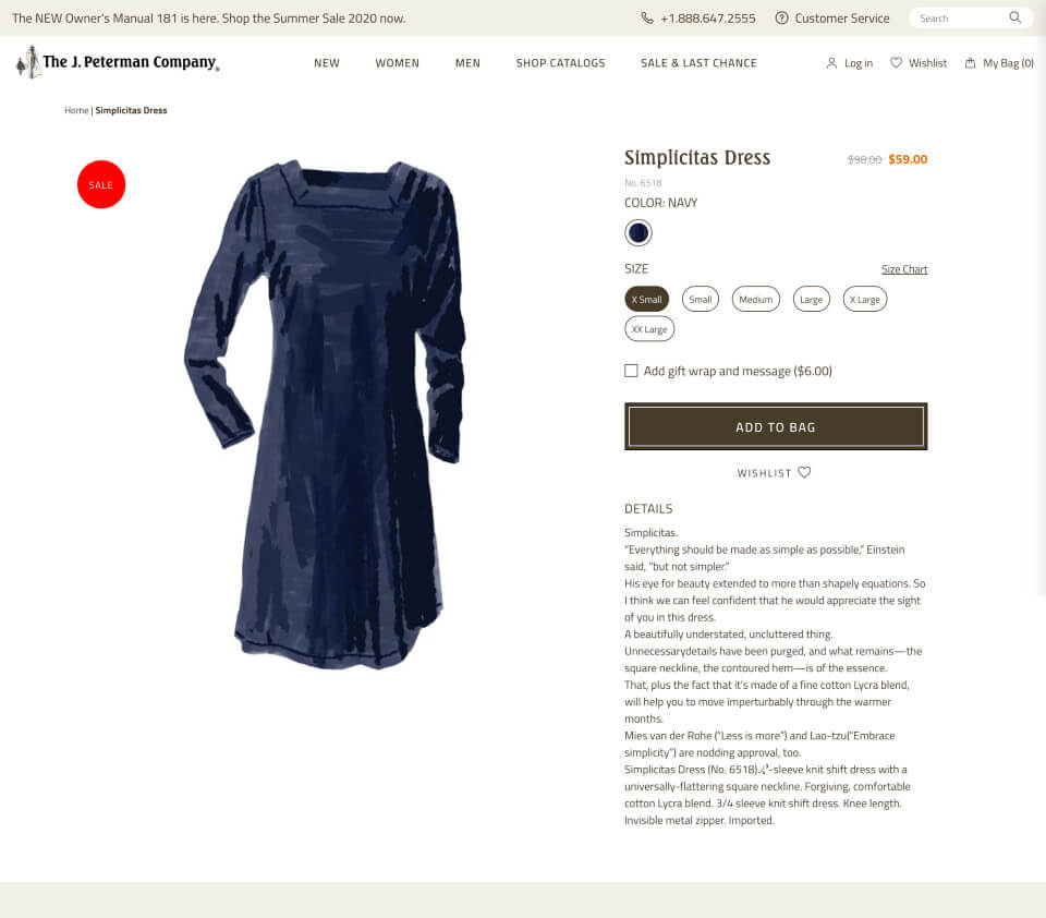
Instead of including a yawn-inducing product description that will make your site visitors’ eyes glaze over, go for a detailed description that adds personality while educating them on the product.
Need inspiration?
Try The J. Peterman Company’s product pages. You will not be disappointed.
21. Use high quality images
Human beings are visual creatures — half of the brain’s neurons are dedicated to vision. To that end, making the shopping experience more visual helps to increase your ecommerce conversion rate and guide them through the conversion funnel.
With ecommerce, online shoppers are not able to touch, hold, or try on the items they peruse. Therefore, the inclusion of high quality images takes on great importance. The images help make the sale and increase the conversion rate in the process.
22. Enable site visitors to zoom in on product images
To increase the conversion rate even further, build in functionality for site visitors to zoom in on product images. This makes the experience more closely resemble an in-person purchase. The user can inspect the product more closely, and therefore will feel that they are better informed. They are also better able to recognize the quality of the product, again making a sale more likely.
23. Use high quality videos
Similar to photos, including product videos on your product pages helps to inform the shopper and guide them to a purchase. Videos have the added benefit that they are more experiential for the viewer, and therefore you can use video to evoke an emotional response from the shopper precisely at the time they are considering your product.
As individuals are now quite accustomed to seeing video everywhere they look online, video is becoming an expectation for certain purchases. Use video as yet one more ecommerce conversion rate optimization tactic.
You can see the power of video in the following Breville Barista Pro Espresso Machine video on the Williams-Sonoma website:
24. Write in a style with a distinctive personality that matches the brand
A distinctive brand personality enables you to connect more deeply with your target audience, and that helps you increase ecommerce sales conversions. When it comes to a brand that consistently crushes it when it comes to a distinctive personality, look no further than Nike.
Nike is fierce. The brand is relentless. And it’s empowering.
Take a recent campaign:
YOU CAN’T STOP SPORT.
If you have a body, you are an athlete. And as athletes, we’re never alone. Sport unites us.
Strengthens us. Keeps us pushing ahead. No matter what happens we will always come back
stronger, together. You can’t stop sport. Because you can’t stop us.
Checkout
25. Make your “Add to Cart” and “Checkout” buttons prevalent.
If you want them to make a purchase, at some point they will need to add an item to the shopping cart and checkout. Don’t be shy. Display large, prevalent buttons to help drive them to purchase. Use a color that contrasts with the page so that the buttons stand out.
26. Make special offers
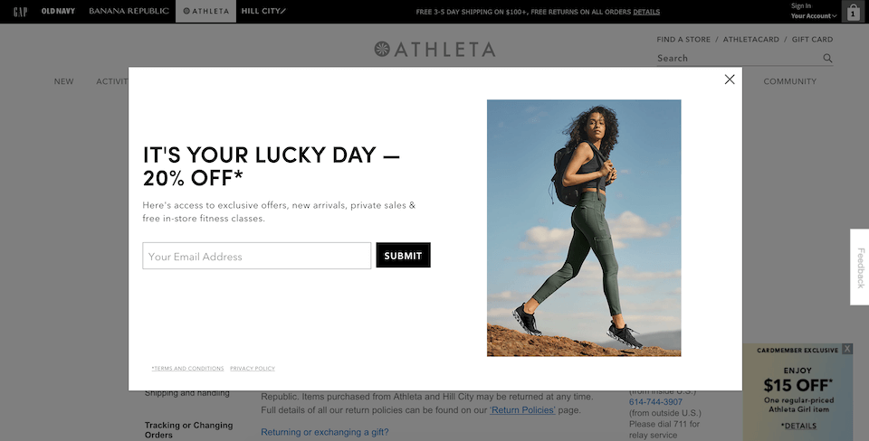
People are hardwired to love a special offer. It makes them feel special (and even smart). Special promotions help convert existing customers (as they already like your brand), and can also be used to transform new site visitors into becoming loyal customers of the brand. Plus, offers make it more likely that shoppers will tell their family, friends or colleagues, helping your brand to expand reach to new audiences. Special offers are of course effective in your website, and they are especially effective when used strategically with targeted landing pages.
27. Offer coupon codes
Ecommerce conversion rate optimization includes testing different special offers. For example, try different coupon codes over time, each equated with a different offer, whether a specific amount off or a percentage discount. Coupon codes are a handy way to test to see which offers resonate most with your audience.
28. Offer free shipping
Shoppers often expect free shipping. If you don’t offer it, expect to lose some potential customers who abandon your site for a free-shipping alternative. Whenever possible, offer free shipping, and in turn, you’ll see your conversion rate increase.
The Brand Intelligence Report
Exclusive AI insights, search trends, and brand strategies, delivered to your inbox.
29. Make the checkout process easy
Every year, trillions of dollars of ecommerce merchandise is left abandoned in shopping carts. It goes without saying, but you obviously need to make the checkout process as seamless, intuitive, and easy as possible in order to maximize conversions. Even something as simple as letting them know which credit cards you accept and which payment options are available can make a difference. Any friction in the process can lead to abandoned carts with a direct impact on your sales.
30. Show shopping cart items
A part of making the checkout process easy and seamless for customers is to show shopping cart items during checkout. It’s a simple thing. It’s a step you cannot skip, though.
31. Allow guest checkout
Don’t force them to register! It’s annoying for your site visitors when they are excited to make a purchase, and then BAM. They are stopped in their tracks because you are trying to force them to register in order to give their money to you.
Don’t be that brand. Allow them to checkout as guests as much as they’d like.
32. Display your telephone number
Sure, it’s 2020, but some people just prefer the phone. Display your phone number so you don’t lose them if they have a question and prefer to talk to a real human being.
33. Use live chat to answer questions
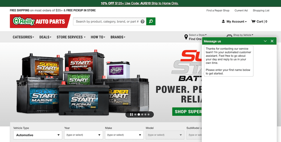
Give them as many options as possible to engage with your brand and to get answers to their questions. Offer live chat for those that don’t prefer the phone and don’t want the delay typically associated with email.
34. Display a progress bar throughout the checkout process
It’s not rocket science, but it is neuroscience. People naturally feel compelled to complete a task once it’s been started. So, use a progress bar to show how far along they are in the checkout process, and you’ll likely see more of them go from checkout page to completion.
35. Have a clear product return policy
Set their mind at ease to nudge them towards a purchase. One effective way to do that is with a clear return policy. If you also have brick and mortar stores, make it clear which policies apply to online purchases, which to in-store items, and which to both. Buyers will be much more likely to try items for which they are on the fence if they know that free returns are allowable for a certain amount of time.
36. Use cart abandonment software to recover lost sales
Don’t let them get away. If someone on your site places items into the cart but doesn’t make a purchase, use shopping cart abandonment software to reel them back in and make the sale. The software can present pop-ups to the customer when they are about to abandon the cart, or you can send them automated recovery emails after the fact. Plus, you can (and should) A/B test both the pop-ups as well as the emails, so that even in recovery mode you are executing ecommerce conversion optimization further.
Forrester Study White Paper
See how fully integrated SEO drives business impact across the enterprise.
Testing
37. A/B test your CTAs
Ecommerce conversion rate optimization is all about testing, testing, testing. With that in mind, we urge you to A/B test the various CTAs in your website. Not only to make a purchase, but also to join your mailing list, download your lookbook, or take advantage of a special offer. Testing two versions of your CTAs will help you to identify specific language that drives them to action more reliably.
38. Test your prices
Along the same lines, A/B test your prices, too. You can test not only the price for a specific product, but also the actual display of pricing itself. After all, $29.00 is the exact same price as $29, but each of these pricing displays may produce very different results.
39. A/B test your forms
An often overlooked area in which to A/B test is any type of conversion form. Use your ecommerce software package to test the checkout process, and use form builder software such as Formstack or JotForm for any other type of form you might need.
40. Use conversion optimization software
Put your A/B testing on steroids by scaling your testing efforts all over your site, no matter the product or page. This is one of the most critical elements of ecommerce conversion rate optimization. Useful software to use for A/B testing of your ecommerce site includes Optimizely, VWO, and AB Tasty.
41. Use behavioral intelligence software
For a holistic view of your visitors’ experience on your site, use behavioral analytics software, such as Decibel, Clicktale, Mouseflow, or FullStory. Analyze heatmaps and recordings to uncover their digital body language, root out friction in the shopping process, and make their experience more seamless.


