

What Is Website Architecture in SEO? (A Simple Overview)
Dec 13, 2019|Read time: 9 min.
Key Points
- Website architecture refers to how information is organized and prioritized on your site.
- Navigation, breadcrumbs, URLs, and sitemaps help search engines understand your site structure.
- Intuitive navigation features like a mega menu, filters and faceted search enable customers to quickly find what they want.
- Internal links emphasize which pages are more important within your website architecture.
Have you ever walked into the clearance section of a large department store the week after Christmas? It’s absolute chaos. There are piles of clothes everywhere; tags are missing; sizes are jumbled up; departments are mashed together. There’s zero sense of organization whatsoever.
That’s exactly what your site would feel like without website architecture. But what is site architecture, and why is it so important for SEO? Let’s start with a clear definition.
What is website architecture?
Marketing term
Website Architecture
Website architecture refers to the planning and design of a site’s information architecture (IA) to establish structure and enhance usability.
In other words, it’s how you group your content into themes, and then sort those themes from broader to more narrow.
Once mapped out, site structure is further defined through elements like breadcrumbs, URL structure and navigation.
Site architecture organizes your content so visitors — including search engines — can easily find what they want. As it turns out, that’s really important for SEO.
Site architecture vs website information architecture
Information architecture (IA) refers to the structure of information. Although it’s frequently used interchangeably with “website architecture,” it’s actually a much broader term. Website architecture is a subcategory of IA that specifically relates to websites.
Make sense?
Now that we have a basic website architecture definition, let’s hop back over to our example of the ransacked department store and imagine it’s a website. How frustrating would it be to shop for men’s polo shirts on an ecommerce site without categories, breadcrumbs, filters or faceted navigation of any kind. Or, perhaps those elements are in place, but they’re not properly organized. Even the URLs would seem random on a domain like that.
Thankfully, most websites aren’t that bad. In fact, the vast majority of ecommerce sites have some sense of website architecture. However, it’s common for large domains to feel a bit disorganized. For massive businesses, this can lead to a maze of issues over time:
- Products that end up eight clicks deep
- Dead ends that return 404 errors
- Mislabeled or empty categories
- Minimally helpful navigation
- Duplicate content
- And so on…
What’s worse, a fragmented website architecture doesn’t just cause those issues, but it also masks them from discovery—especially if your own website has hundreds of thousands of pages.

Fortune 500 Enterprise SEO Playbook
Discover how enterprise brands can create content that builds authentic audience connections.
Website architecture for SEO
If you thought finding one polo shirt was hard, imagine being tasked with creating a map of the entire website. You have no context whatsoever. Yet, you need to extract context from hundreds of thousands of web pages to determine if this is a fashion blog, a photography site or an ecommerce store.
Then, you need to itemize each product and location. When someone’s looking for a black, size twelve romper, you should be able to tell them precisely where to find it.
This is similar to what search engines do: Google crawls every indexable URL on your site to determine context. The more disorganized your site architecture, the less context search engines have about your website’s purpose, and the less likely you’ll rank for your preferred keywords.
It also means crawlers will spend more time trying to piece together the puzzle, which wastes crawl bandwidth. And any errors encountered along the way—like long redirect chains or 404s—exacerbate the problem.
Crawlability issues are just the tip of the iceberg when it comes to how site architecture impacts ecommerce SEO. You also need to consider content organization and on-page optimization.
Is each page on your site optimized for the right keywords? Are there any major gaps in your keyword research? What about overlapping content causing keyword cannibalization? With no sense of prioritization, Google will simply have to guess which page is the best fit for each query. On top of this, SEO equity won’t flow properly without a clear hierarchical structure, causing lackluster performance across your entire keyword landscape.
Website architecture for customers
Site architecture similarly impacts user experience. The more confusing the journey, the less likely the user is to enjoy it or to complete it. Every product or service on a large website should be in a logical place that makes it incredibly easy to find. When users get lost, reach a dead end or become confused, bounce rates and shopping cart abandonments increase.
There’s nothing more frustrating than losing a conversion-ready customer due to poorly organized website architecture.
Website architecture best practices
Good website architecture looks somewhat like a pyramid. The home page sits at the top, which branches into a few high-level departments, which branch into main categories, subcategories and so on.
Each new category layer is built on the previous one, so it’s critical to get them right. Otherwise, you’ll end up with products that feel out of place within their parent categories. Or worse, customers won’t be able to find them at all.
To avoid that scenario, conduct user research so you know how your target audience would organize your products before you ask your web design team to wireframe your navigation. Card sorting is a great way to organize your content in a way that makes sense to your customers.
Run a card sort
There are several ways to run card sorting sessions. You can provide test subjects with predetermined categories in which to group products. Or, you might offer sorters a selection of products and ask them to logically group the cards. Then, subjects would name the categories themselves.
Card sorting helps to eliminate your own internal bias and find patterns in the way your user personas think.
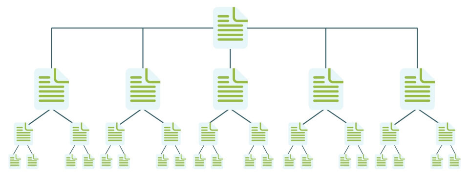
Deep vs flat website architecture models
Site architecture is often described in terms of flat vs deep. This simply refers to the structural depth of your site. In other words, how many categories and subcategories you have, or the number of folders in your URL. Here’s an example of a flat ecommerce website architecture diagram.
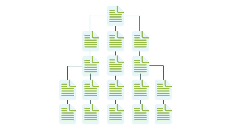
Conversely, a site with deep architecture usually requires many more clicks to reach pages. This type of architecture tends to have many layers of subcategories and isn’t the best user experience. Here’s a deep website architecture example
Flat architecture is considered better for SEO because it helps both search engines and users navigate the site quickly.
Even large, complex ecommerce sites with many subcategories can get creative with faceted navigation to maintain a flat website architecture. Take Target for example. Faceted search allows users to navigate directly to the men’s polo shirts category page from anywhere on the site without visiting unnecessary categories like “men’s clothing” or “men’s shirts” to get there.

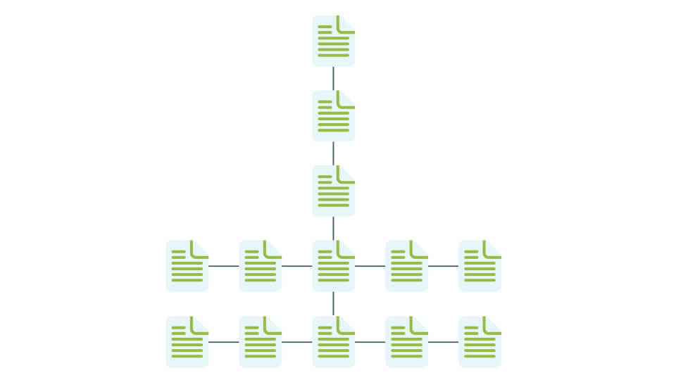
The most important important consideration when creating your website information architecture is that your site is organized, logical and intuitive to navigate. What we don’t want is architecture that looks like this:
In other words, don’t force clicks when you don’t need to.
Website architecture and UX
One of your top user interface design goals should be to help users find exactly what they want as quickly as possible. So if it’s easier to locate a casino exit than your product pages, follow these tips to shorten the customer journey.
- Rethink your top navigation – It’s a good idea to periodically revisit your top navigation and account for shifts in business goals, inventory or user behavior. Provide your customers with as many top-level categories as necessary, but as few as possible. Adding more top-level categories reduces the number of clicks to conversion pages. Just don’t add so many that it’s a chore to read through all the options on the top navigation.
- Use a mega menu – Mega menus are a common solution for sites with extensive product lines. These menus expand into organized lists of options so the user can access information much more quickly. They can then navigate through several layers of subcategories without ever clicking away from the navigation menu.
- Use faceted search – As we already discussed, faceted navigation is a user-friendly way to eliminate unnecessary category pages, reduce click depth and drastically speed up the browsing experience. But make sure you don’t create other common issues through improper implementation, such as duplicate content.
Site navigation best practices
Navigational elements help to reinforce the hierarchy within your website architecture so search engines understand your top priority pages. But navigation also creates clear pathways for customers to achieve their goals on your site. Therefore, we could argue that navigation is one of the most important design elements on the page.
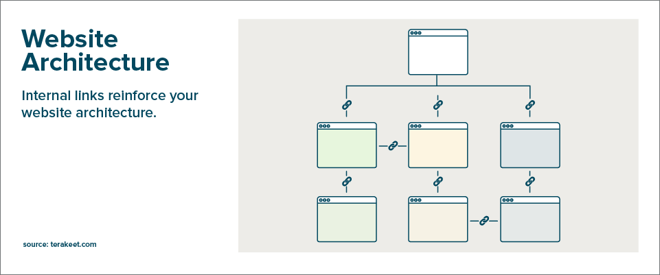
Internal links
When you link to pages within your site, those internal links convey context through page relevance, link intent, anchor text and even the copy surrounding the link. Internal links also pass important link equity, or PageRank, to key lead generating landing pages throughout your site.
Link to your most important URLs frequently, especially from your homepage, your navigation and other relevant pages with authoritative backlinks. If you already prioritized backlinks, it’s time to invest in your internal linking structure.
URL structure
Keep URLs short, clean and straightforward. The URL structure should also align with both navigation and breadcrumbs for consistency.
Remember our example from Target earlier? Let’s take a closer look at the polo shirt category page. Notice how the breadcrumbs align with the navigation path we followed to reach the page:

However, the URL structure doesn’t match the breadcrumbs or navigation:
- https://www.target.com/c/polo-shirts-men-s-clothing/-/N-55cxg
Based on the navigation and the breadcrumbs, a more appropriate URL structure would look like this:
- https://www.target.com/c/mens-clothing/shirts/polo-shirts/-/N-55cxg
Breadcrumbs
If a customer is just window shopping on your site, they won’t make a beeline straight to the product they want. Instead, they’ll look at different options and frequently bounce between products and categories.
Breadcrumbs tell users where they are within your site structure while providing an easy navigation path back to a parent category. Further breadcrumbs also give search engines more context about your site’s hierarchy. So implement a breadcrumb structure that matches your site navigation.
Pagination vs infinite scroll
Should you paginate a large list of products or locations? Or, should you load more content as the user scrolls or clicks a “load more” button? It depends. Infinite scroll can be a nice way to help the user avoid clicks, making it especially helpful for mobile. However, pagination gives the user a greater sense of control. And the page numbers help them keep a “mental map” of where the product was. This lets them quickly navigate back to something they liked.
Most sites should stick with pagination. But infinite scroll may work great for your blog.
Canonical tags
From faceted search to pagination, some of the most user-friendly options often necessitate a double-check on canonical tags so you don’t create duplicate website content. Make sure all versions of each web page canonicalize to their parent page, and use absolute (not relative) URLs.
Finally, whenever you do decide to change your website architecture, do the legwork to make sure your changes won’t hurt your SEO.

Value of Organic Search White Paper
See how an investment in organic search delivers ROI that compounds over time.
Final thoughts
Tearing down your entire site structure and rebuilding it would be nearly akin to a site migration. And even the most perfect 301 redirects can’t fully offset the SEO impact of a change that large.
Work with the architecture you have and introduce changes gradually. Check each page’s SEO success metrics prior to deleting or moving it. When you do move pages, use redirects and update relevant internal links.
If you’re unsure about the SEO impact of making changes to your website architecture, reach out to our team of experts for guidance.

The Brand Intelligence Report
Exclusive AI insights, search trends, and brand strategies, delivered to your inbox.


Learn how consumer insights can drive consumer connection
What We DoUnlock instant access to 25+ digital marketing resources and the OAO 101 introductory email course to kick start your strategy.